INTRODUCTION
Choosing a living room colour palette in Malaysia is harder than it should be, because most colour advice is written for homes in cooler climates with a very different quality of natural light.
In Malaysia, the direction, intensity, and spectrum of natural light in most condos — combined with the visual temperature of air-conditioning — changes how paint colours read on a wall. A paint chip that looks warm and creamy in a paint shop looks slightly clinical on a north-facing condo wall in the afternoon. A greige that looks flat on a swatch becomes rich and layered when it fills an entire sunlit room.
This guide addresses Malaysian light conditions directly, gives you the palettes that work consistently in our homes, and walks you through the process of choosing a colour scheme that functions in your specific space.
Photo by Pinterest
Why Colour Behaves Differently in Malaysian Homes
How Tropical Light Changes Paint Colours
Natural light in Malaysia has a warm, yellow-rich spectrum — particularly in the afternoon when direct sunlight enters most west and south-facing rooms. This warm light amplifies warm-toned colours (making them richer and more saturated) and distorts cool-toned colours (making blues appear slightly green, greys appear slightly purple or lilac, and cool whites appear clinical or faintly blue).
The practical implication: colour palettes that work beautifully in a Scandinavian home with cool grey northern light will often read wrongly in a Malaysian home. When in doubt, choose warmer rather than cooler — our light enhances warm tones and struggles with cool ones.
The Single-Window Condo Problem
Most Malaysian condo living rooms have natural light entering from one direction only — a single window or sliding door to a balcony. This means one wall is bright (the window wall) and the wall opposite receives only reflected ambient light. For layout considerations in single-window condos, see our living room layout guide for Malaysian condos.
A colour that looks correct in the bright half of the room may read as darker and more saturated in the shadowed half. Paint the shadowed wall and the bright wall in the same colour and observe both under the actual light conditions before making a final decision. In some rooms, a very slightly lighter tone on the window-opposite wall corrects the imbalance.
Testing Colours in Malaysian Conditions
Paint chips and digital swatches are unreliable guides in Malaysian light conditions. The only reliable way to assess a colour is to paint a 30×30cm test patch on the actual wall and observe it at three times: morning (pre-noon), afternoon (2–4pm when direct light is often strongest), and evening (under artificial lighting).
A colour that passes all three conditions is a colour that will work in your home. A colour that looks right in the morning but wrong in the afternoon will bother you every afternoon for as long as it is on the wall.
Which Palette Is Right for Your Situation?
Before diving into the four full frameworks, here is a quick orientation by the most common search scenarios:
Best Palette for a Small Malaysian Condo Living Room
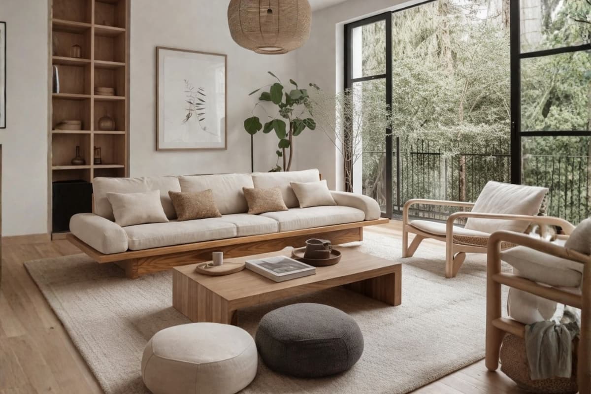
For small condos — typically under 700 sq ft with limited natural light — the Warm Neutral Base framework is the most consistently successful choice. Warm white walls maximise reflected light and create visual space; a single earth-tone accent (terracotta, sage, or caramel) in the sofa or rug does the personality work without crowding the room visually. Avoid feature walls and dark tones in spaces under 12×12 feet.
Modern Malaysian Living Room Palette
A modern Malaysian living room palette is best served by Tonal Monochrome — one colour family expressed across multiple values and materials. An all-greige room (warm white wall, warm stone sofa, natural jute rug, ash wood coffee table) reads as considered and contemporary without requiring precise cross-manufacturer colour matching. For a deeper comparison of modern versus contemporary furniture styles, see our modern vs contemporary furniture guide.
Simple Palette for a First-Home Malaysian Living Room
The simplest starting point for a first-home Malaysian living room is: warm white walls, a natural wood TV console, and a neutral sofa in warm stone or warm beige. Add one accent colour in cushions or a rug only once the main pieces are in place. This approach keeps decisions sequential and avoids the common mistake of choosing wall colour before furniture is selected.
Best Overall Palette for a Malaysian Living Room
The single most successful palette across the widest range of Malaysian living rooms: warm white or greige walls, natural wood accents, a warm neutral sofa, and one earth-tone accent in a rug or cushions. It is congruent with our light spectrum, compatible with every furniture style, and forgiving of the slight colour variations that occur across different manufacturers and materials.
The 4 Colour Palette Frameworks for Malaysian Living Rooms
Rather than choosing a specific colour, start by choosing a framework — a structural approach to how colours relate to each other in the room.
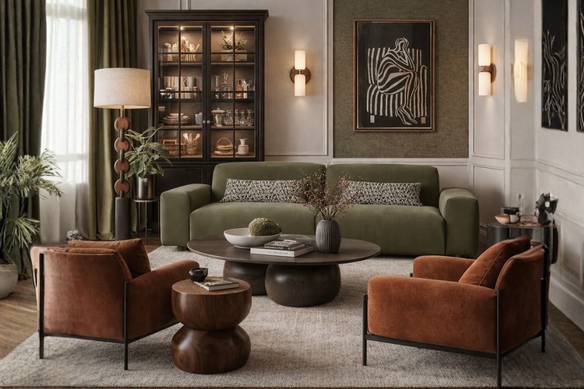
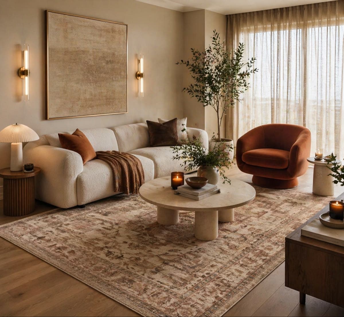
1. Warm Neutral Base (The Most Consistently Successful Choice)
Warm white walls, natural wood furniture, one earth tone accent. This is the palette that works in 90% of Malaysian living rooms because it is congruent with our light spectrum, compatible with most furniture styles, and visually calming without being sterile.
The accent tone does most of the room's personality work — warm terracotta, dusty sage, warm stone, or caramel. It appears in the sofa fabric, rug, cushions, or one or two ceramic pieces. The walls and wood remain constant; the accent is replaceable as tastes evolve.
2. Contrast Palette: Dark Accent Wall + Light Furniture
A single feature wall in a deep tone — warm charcoal, deep navy, forest green, or burnt umber — with light furniture and a light opposite wall. This is a high-impact palette that works best in rooms with good natural light and ceiling heights of 2.8m or above.
In a low-ceiling condo with limited natural light, a dark feature wall makes the space feel smaller and the ceiling lower. In a well-lit terrace house living room with 3m ceilings, the same wall becomes a confident design statement. See black sofa living room ideas for how to work contrast palettes around darker furniture.
3. Tonal Monochrome: One Colour, Multiple Values
An all-beige room — wall in warm white, sofa in warm stone, cushions in caramel, rug in natural jute, wooden accents in light ash. An all-sage room — soft sage wall, stone-grey sofa, dusty terracotta accent, natural wood.
Tonal monochrome works in Malaysia because it creates visual coherence without requiring precise colour matching across different manufacturers and materials. Slight variations in shade between the wall, sofa fabric, and rug fabric look intentional rather than mismatched when they are all within the same colour family. This framework pairs naturally with Japandi interior design, where tonal restraint is a defining aesthetic principle.
4. Nature-Inspired Palette: Biophilic Colour
Terracotta walls or accent pieces, clay and warm ochre textiles, olive and forest green plant tones, warm stone and sand. This palette draws from the Malaysian natural landscape and performs well under our warm-spectrum light because it is drawn from the same colour temperature as the light itself.
Biophilic palettes are the easiest to execute in a Malaysian home — they are inherently climatically congruent. The main risk is literal interpretation: a terracotta wall, an orange rug, and orange cushions in the same room tips from biophilic warmth into a single saturated tone that visually exhausts. For bolder green expressions, see emerald green sofa living room ideas.
The Most Popular Living Room Colours in Malaysia Right Now (2026)
Warm White and Off-White: The Perennial Foundation
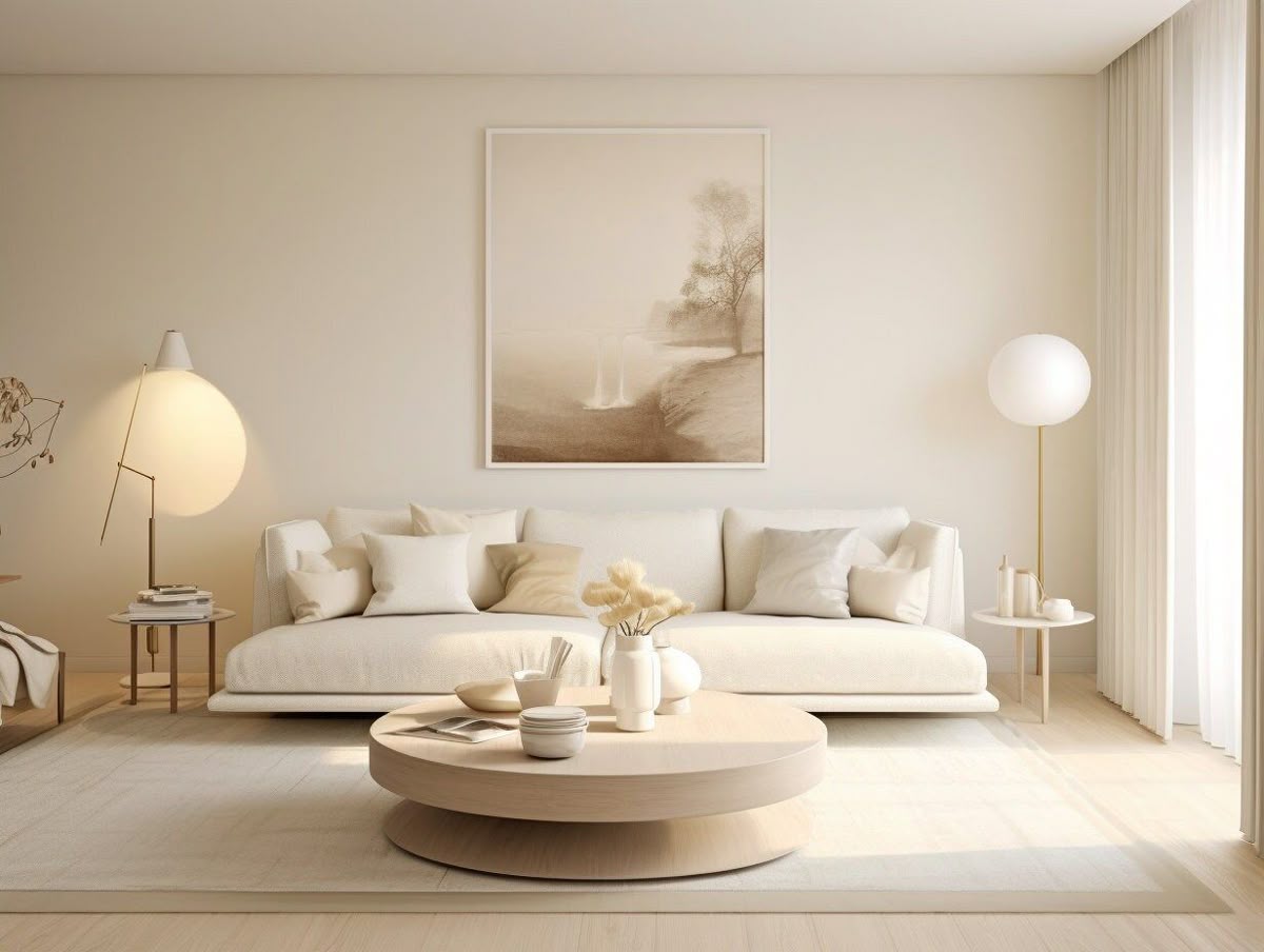
Photo by Pinterest
The most widely used living room base colour in Malaysia and for good reason. Warm white maximises reflected light in rooms with limited natural light, creates visual space in condos, and works with every furniture style and material palette.
Useful Malaysian options: Dulux Antique White USA, Nippon Pearl, ICI Ceiling White with a warm additive. Avoid: pure white (Dulux Natural White, Nippon Pure White) — these read as clinical in Malaysian light conditions.
Greige: The Colour That Works in Every Malaysian Living Room
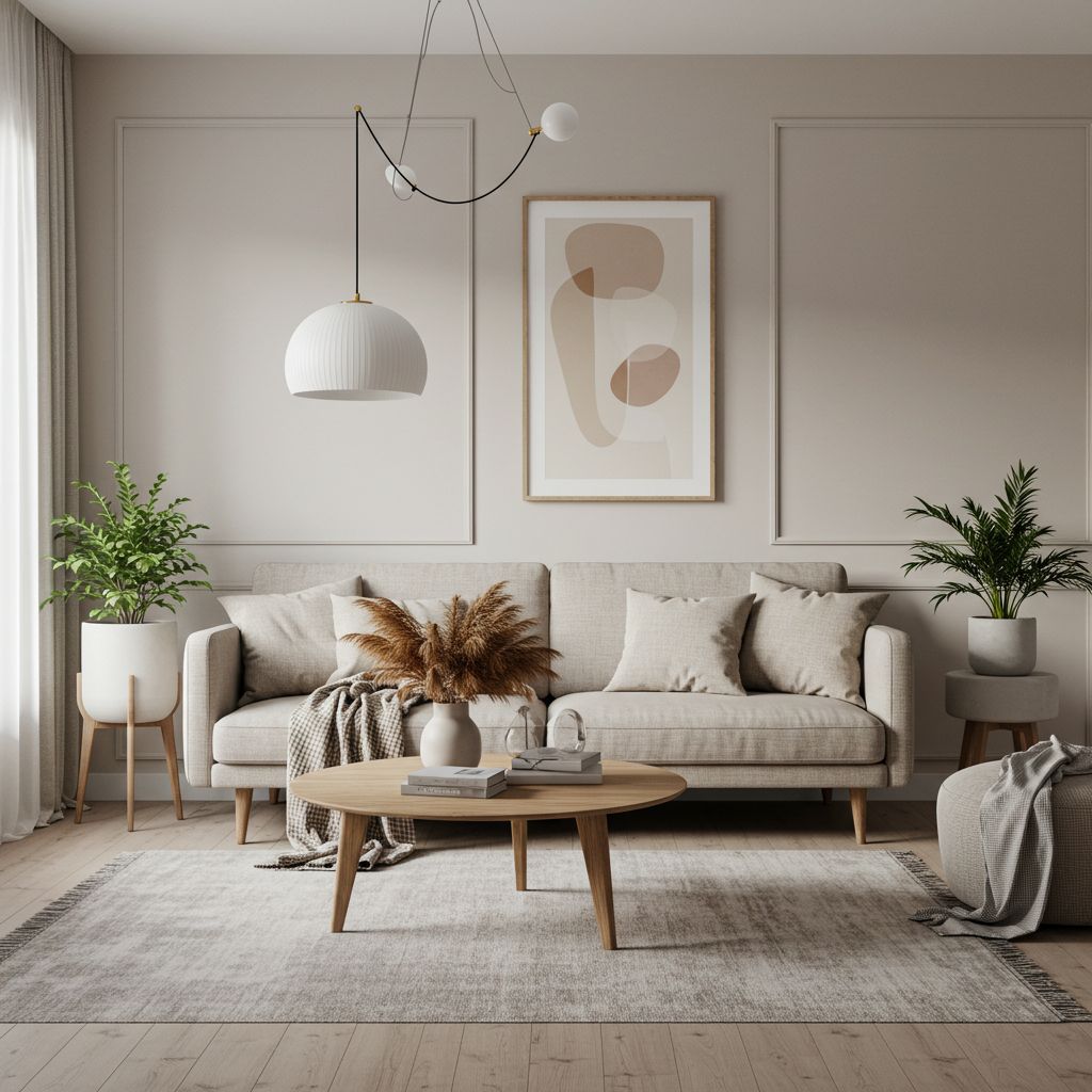
Photo by Pinterest
Greige — a grey-beige hybrid — is the single most reliably successful living room colour in the Malaysian context. It handles both the warm afternoon light and the cooler blue-white of LED lighting without distorting. It reads as sophisticated without imposing a strong aesthetic direction, making it compatible with almost every furniture style from contemporary to transitional to Japandi.
Recommended Malaysian greige options: Dulux Bleached Greige, Nippon Greige family, ICI Subtle tone range.
Sage Green: The Statement Colour of 2024–2026
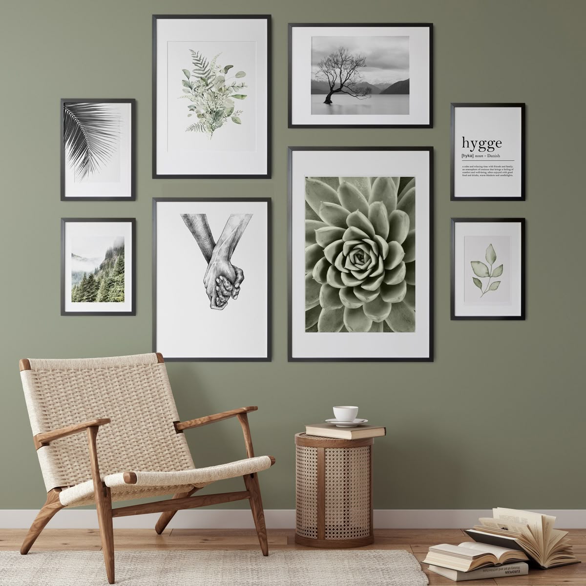
Photo by Pinterest
As an accent wall colour or as a dominant tone in a biophilic palette, warm terracotta and clay read beautifully in Malaysian light — the warm spectrum amplifies their richness without making them feel heavy. Best applied: in rooms with 2.8m+ ceilings and good natural light. Use sparingly in low-ceiling condos with single-direction light, where it can feel dark and dense.
Warm Terracotta and Clay
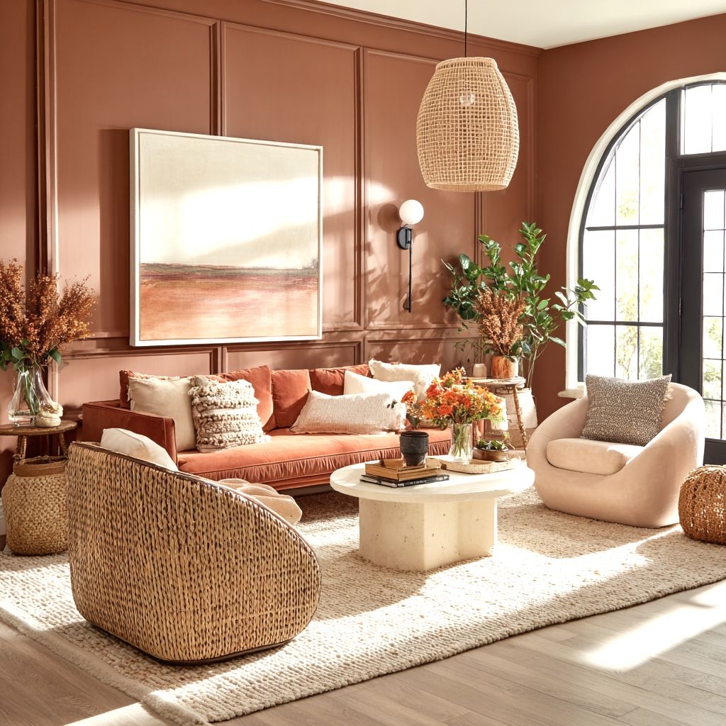
Photo by Pinterest
As an accent wall colour or as a dominant tone in a biophilic palette, warm terracotta and clay read beautifully in Malaysian light — the warm spectrum amplifies their richness without making them feel heavy. Best applied: in rooms with 2.8m+ ceilings and good natural light. Use sparingly in low-ceiling condos with single-direction light, where it can feel dark and dense.
Deep Navy and Charcoal: The Feature Wall Option
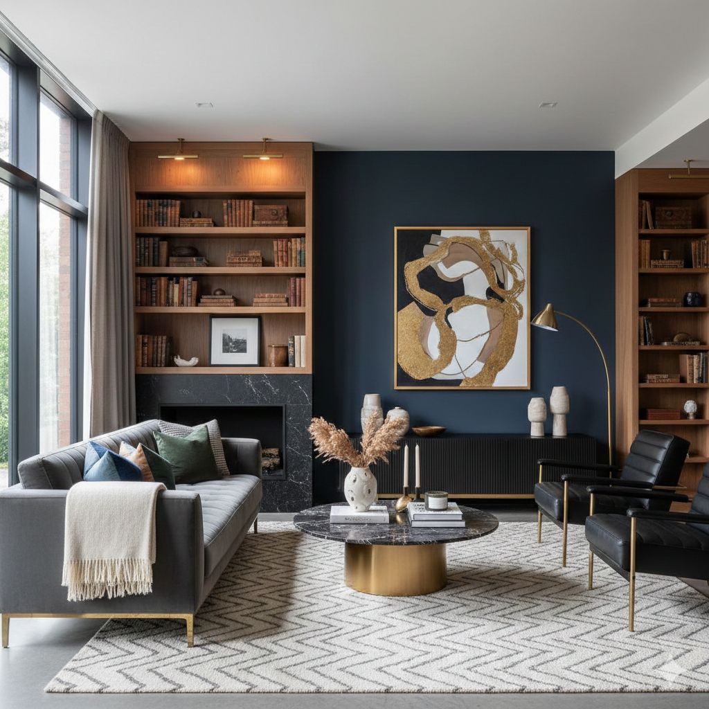
Photo by Pinterest
Deep navy and warm charcoal work as feature wall colours in Malaysian living rooms with strong natural light and furniture that provides sufficient light contrast. Both require a well-lit room to prevent the dark wall from making the space feel compressed.
Avoid in: rooms under 12×12 feet, rooms with a single small window, and rooms with low ceilings. These conditions amplify the wall-closing effect of a dark colour.
How to Choose a Colour Palette for Your Living Room
A five-step process for making a colour decision with confidence.
Step 1: Identify Your Fixed Elements
Floor colour, existing furniture you are keeping, and any permanent architectural features (coloured tiles, a timber staircase, exposed brick) are your fixed elements — they cannot change, so everything else must work with them. List the dominant tones in these fixed elements before considering wall colour.
Step 2: Choose Your Dominant Colour (60%)
The 60% colour dominates the room — it is the wall colour and the largest furniture piece (typically the sofa). This does not mean both must be the same colour, but they should be tonally compatible. A warm white wall and a warm stone sofa both belong to the warm neutral family — they are different but tonally related.
Step 3: Choose Your Secondary Colour (30%)
The 30% colour appears in upholstery, rugs, curtains, and larger decorative pieces. It creates contrast with the dominant colour without challenging it. In a warm white and warm stone living room, a natural wood tone works as the 30% colour — present in the coffee table, TV console legs, and picture frames.
Step 4: Choose Your Accent Colour (10%)
The 10% accent appears in cushions, ceramic objects, plants (both plant and pot), artwork, and small accessories. It is where the room's personality is concentrated. Choose one accent colour — not two. Two accent colours in a room that already has a dominant and secondary colour produces four competing tones, which exceeds most rooms' visual coherence threshold. An accent chair is one of the most effective ways to introduce the accent colour at a scale large enough to register without overwhelming.
Step 5: Test in Your Actual Light Conditions
Apply the 30×30cm patch test for wall colour. Hold fabric swatches against the wall sample for sofa and curtain decisions. Observe everything in morning light, afternoon light, and evening artificial light. A combination that works across all three is a combination that will live comfortably in the room.
Matching Sofa Colour to Wall Colour
The sofa and the wall together constitute the majority of the room's visual surface. Getting their relationship right is the most important single colour decision in a living room. For more guidance on sofa and curtain coordination, see our guide on how to match sofa and curtains.
Light Wall + Light Sofa: Avoiding Washed-Out
A warm white wall with a warm stone sofa is the most commonly executed Malaysian living room palette — and when done well, it is genuinely successful. The risk is that without sufficient contrast from the wood tones, rug, and lighting, the room feels tonally flat.
Countermeasure: ensure the coffee table and TV console provide clear wood tone contrast. Use a natural fibre rug in a distinctly different tone (jute natural, warm terracotta cotton, or sage polypropylene) — see our rug size guide for sizing guidance. Add one pendant or floor lamp that introduces a warm amber light source.
Dark Wall + Light Sofa: The High-Contrast Approach
A deep charcoal or navy feature wall with a stone or warm white sofa creates a dramatic contrast that reads as highly intentional. This combination requires the room to have sufficient natural light to prevent the dark wall from making the space feel enclosed.
If the room has good natural light and a ceiling of 2.8m+, this approach produces a living room with strong visual character. In a low-light condo, it typically produces a room that feels smaller than it is.
Neutral Wall + Statement Sofa: The Safest Route
A warm white or greige wall with a sofa in a more assertive tone — warm terracotta, deep sage green, warm ochre, rich caramel — gives the room a clear colour focus without committing a large fixed surface to a bold decision.
This is the most flexible approach because the sofa can eventually be reupholstered or replaced if tastes change, whereas a feature wall commitment is more involved to undo. For buyers in their first home or buyers who are uncertain about committing to a strong wall colour, this is the recommended starting point. For a full guide to interior design styles in Malaysia and how colour fits within each, see our cornerstone guide.
Interior Designer · FRWD Furniture
Malique is an interiors and lifestyle specialist at FRWD Furniture's Bangsar Experience Centre, offering practical perspective on furniture selection, room styling, and the design principles that make a home feel intentional.
Frequently Asked Questions
1.What is the best living room colour for a Malaysian condo?
What is the best living room colour for a Malaysian condo?
Warm white or greige are the most consistently successful base colours for Malaysian condo living rooms. Both work with our warm-spectrum tropical light, create visual space in smaller rooms, and are compatible with most furniture styles. Greige in particular handles both warm afternoon light and cooler LED evening light without distorting.
2.Why does white paint look different in my Malaysian home than in design photos?
Why does white paint look different in my Malaysian home than in design photos?
Most design photography is shot in European or North American homes with cool grey-blue natural light. Malaysian homes have a warm yellow-spectrum natural light. Cool whites look clinical or faintly yellow in our light conditions; warm whites read as the fresh, bright white that cool whites provide in cooler climates. Switch to a warm white (Dulux Antique White USA, Nippon Pearl) for the result you see in photographs.
3.What colour sofa goes with cream or warm white walls?
What colour sofa goes with cream or warm white walls?
Warm stone, caramel, warm sage green, or warm terracotta all work well against warm white walls. Natural wood furniture tones provide the necessary contrast. Avoid light grey sofas against warm white walls — the cool grey and warm white fight each other, and neither wins.
4.What is the 60-30-10 colour rule?
What is the 60-30-10 colour rule?
A practical framework for a balanced colour scheme: 60% dominant colour (walls and largest furniture piece), 30% secondary colour (upholstery, rugs, curtains), 10% accent colour (cushions, accessories, small objects). The ratios ensure one colour leads, one supports, and one adds punctuation — without any two colours competing equally for dominance.
5.Is sage green a good colour for a Malaysian living room?
Is sage green a good colour for a Malaysian living room?
Warm sage green works well in Malaysian living rooms that receive good natural light. It reads as calm, contemporary, and is particularly effective as a feature wall colour or as a sofa/textile accent against warm white walls. In low-light condos, use sage as an accent rather than a dominant colour.